Hi Wale, can we meet you?
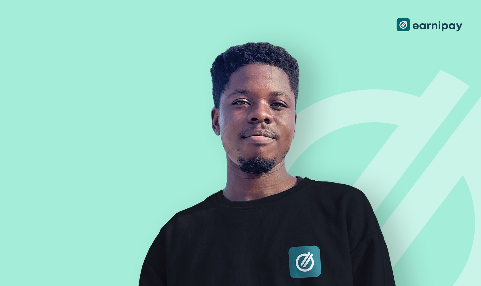
My name is Olawale Lawal, and yes, my last name is a palindrome, and it sits perfectly in the middle of my first name, o-Lawal-e; get it? haha!. I am one of the engineers at Earnipay, and I function as a senior front-end developer.
I like to say that my life officially started in 2012; that was when I was super-consciously aware of myself & my life and realised I actually own my life, and I have sudo access to how deeply I can actually control it. I started consciously making important decisions that have positively impacted my life till today. I was 15 years old at the time and had just completed my secondary education in a military school: Command Day Secondary School, Odogbo Barracks, Ibadan.
Can you share a bit about your background and how you became interested in front-end development?
I’ve always had a thing for visuals. I was very good at drawing: from drawing random objects & animals & when I was younger to architectural diagrams like building plans (front view, side view, top view & all) when I got older. In fact, I once created 20+ pages of my drawings back when I was 10 years old ish, which my then 5-year-old baby sister eventually doodled all over, & destroyed it.. haha, funny times.
In addition to visuals, I’ve always been very fascinated by the existence of technologies & software and how it’s being used to solve so many problems in so many aspects of life, from transportation to finance to agriculture and so much more. This spiked my interest in choosing to study computer science at my university level in FUTA in 2012 and self-learning web development & graphics design (with Adobe Photoshop CS3) simultaneously back in 2013. In 2015, I got my first paid gig. From then on till date, I’ve built 20+ web apps (some as full stack, some as frontend-only), made 3000+ graphics designs (mostly adverts for small businesses), and designed 5+ products (UIUX designs) in which some metamorphosed into actual web & mobile apps.
At some point in 2020, I realised I was doing too much, spreading too wide, and it was even becoming too difficult to sell myself. I was all over the place and was having burnouts too often; therefore, I decided to streamline my skillsets. I combined my love for programming and my love for designs & visuals, found the connecting space in the Venn diagram, and chose Frontend development as my main forte; and tadaaa! here I am today, building visually appealing apps that are solving real problems for people and companies while simultaneously generating revenues and/or cutting down costs for the business owner(s) 🙂 yippee! 🙂 🙂 🙂
What motivated you to focus specifically on designing web experiences for startups?
I actually enjoy building for both startups and already established businesses. However, for startups, I love being a part of a product’s success; building it from scratch to fruition and seeing it live in the market catering to users’ needs is always an exciting experience and a moment to behold. And in the last decade, there has been a high number of start-ups springing up, and hence, there’s been quite a number of new products to build.
What’s your Earnipay story, and how has your experience been?
I joined earnipay on contract at a very early stage, in mid-2021; the company only had a logo then. I loved the idea, what problem it was trying to solve, and I was happy to be a part of the product’s success. At that time, we didn’t have any initial frontend codebase, so I was pretty much starting from <!DOCTYPE html>. This was a very vital stage for the business because it was at that point technologies to use were determined, foundations were laid, and scalability was guaranteed. I took up the responsibility of building a fast, responsive, highly-robust, and highly-interactive product for earnipay and everyone loved it. Soon after, I was offered a full-time role which I accepted, things moved pretty fast, and we grew from having 1 web app to 3 apps, and today, we have about 7 apps, all of which I have significantly contributed to.
From my day zero here at earnipay, it has been an amazing experience. I love working with everyone in every department; we are all friendly, highly skilled in our domain, open to listening, and always contributing to making the company succeed. In fact, earnipay should be giving testimonies every Sunday for having such a set of talented people coming together to achieve the company’s objectives… haha 🙂
You are known at Earnipay for always overcommunicating – is this an experience that led to you embodying this?
haha, I didn’t see this question coming at all. The short answer is: “I prioritise people understanding what I’m saying over how much I actually say”. So if I have to say ABC instead of just A, for the person to understand the picture fully, I would say the ABC and not mind the stress. I feel this helps prevent a lot of misunderstandings, especially when I know that the misunderstanding can lead to adverse effects.
What unique challenges do you face when designing for startups compared to larger companies?
The main challenge is rapid changes. Because of how super-intentionally startups are about their products and how users interact with them, they change things a lot irrespective of what stage of development the product or feature is. As a developer, it’s actually not something to get furious about because, let’s face it, it’s a startup; they need to get things right and hit the intended market in order to survive as a business; so for developers, the best approach is to embrace it and manage the interactions with the product manager, then build version 1 features while creating room for version 2, 3, 4, etc.
Can you describe your typical process when starting a new web design project for a startup?
My process typically looks like this:
A. Understand the business requirements.. what it’s trying to achieve.
B. Run through the design with the team to ensure we’re all on the same page. The team = product manager, frontend, backend, QA, and the designer himself/herself.
C. After the design review, list “sub-tasks” or “milestones” of the project on my personal “Stickies” app. This is what I use to track my progress.
D. Understand how best to slice the design components.
E. Understand what components are already available (from previous features) and what new ones to build.
F. Start working on the sub-tasks one after the order.
G. Work with the backend devs to consume necessary endpoints
H. Double-check each subtask to ensure it works as expected
I. Repeat steps F, G & H until everything is completed.
J. Deliver the completed product/feature before the deadline.
How do you balance creativity and functionality when designing web experiences?
For this, I work with the designer a lot to ensure we have not only a visually-appealing app but also something implementable for the developers and easy to use for the users. However, it’s important to know that the designer may not give you everything. For example, micro-interactions at the click of a button, the UI for when a user’s record is loading/not found, or the UI for when a user clicks an email confirmation link that has expired. In all these cases, I leverage my product design experience and build something creative yet functional enough for the users to easily understand what exactly is going on at every point in the app without them having to raise support tickets to ask questions.
What are some key considerations you keep in mind when designing for user experience in the startup environment?
For startups, one thing I always have in mind is: It’s a startup, which means it’s not super-popular yet, which means people are generally not familiar with the app and how it works and all, which means there’s a learning curve for a lot of people. Therefore, I always put myself in the shoes of someone using the app for the first time: how will they know what to do and what to click? How will they know when something is loading or when they’re submitting the wrong values? So to cater to these things, I always put a lot of micro-interactions and toast messages and help texts where it seems fit. To ensure no one is lost.
I always ensure the app’s structure is very solid, robust enough to handle any weird API or User behaviours, has necessary abstractions and reusable components & functions, and is easy to build/scale on for any developer (myself or not) that would be working on the app next – this last point is very paramount because startups scale very fast.
Have you noticed any trends or shifts in web design for startups in recent years? If so, could you elaborate on them?
Yes, technology is always advancing, and it’s the duty of the developer to understand the latest trend, know if it’s just hype or it’s the real deal, know when it’s safe to adopt and when to wait, and finally, how to fuse it into existing codebases without blowing up the app. One such trend change I’ve experienced is the introduction of functional components in React. Back when I started React, class components were in vogue; however, tech shifted, functional components became the real deal, and I needed to switch while causing zero harm to my apps. I remember I made the switch across the apps I was building then, and no user even noticed anything changed; they were still enjoying the smooth, seamless experience they’ve always enjoyed on the apps.
How do you approach working with cross-functional teams, such as product managers and designers, to bring a design to life?
One of the things that can make the life of a front-end developer awesome is making the product managers and designers your friend. Why? because you’d be working with them a whole lot. At earnipay, we all work towards achieving the same company’s objective; we have design review sessions, understand what would fly and what wouldn’t, and how best to make any necessary adjustments to ensure an optimal experience for the users. And I must say, the Product manager and designers at Earnipay are the best there is; working with them anytime, any day is bliss. I wish I could put them in my pocket and take them anywhere I’m going.. Haha.
Can you share a memorable project where you had to think outside the box to overcome a design challenge?
There was this codebase I inherited back in the day. One of the issues on the app was: one of their downloads was not working. When I checked out the codebase, it turns out the download actually works, but it takes a while to complete because the data is being sourced from a third party. I quickly understood this was a design challenge because when a user wants to make a download, all they are presented with is a little download icon, and when they click it, (to them) it does nothing. Therefore, rather than opening support tickets with the third party and waiting for weeks/months to see if they can make the downloads a bit faster, I just added a “loading” micro-interaction and a message to make the users aware that the app has received their download request, it’s processing it, and it would typically take 2 minutes to complete. We were able to ship the fix within just 1 day as compared to waiting for months to hear back from the third party; This drastically reduced the complaint rate of the download feature because the users were now aware that the system was working on it, and they only need to wait a couple of minutes to get their download.
What tools and technologies do you find most useful in your role as a front-end developer?
For this, I would say Typescript. It’s an awesome tech and helps foresee a lot of mishaps before they even happen. Another one is icon packs like font-awesome. Back in the day, we always have to download & import an image of every icon we need. But with the advent of icon packs shaped as fonts, using non-custom icons became a whole lot easier.
How do you stay updated with the latest industry trends and advancements in front-end development?
I leverage mostly on social media by subscribing to tech handles on Twitter & LinkedIn, tech channels on youtube, and others. I also have a few newsletters I am subscribed to that deliver tech news & events in my inbox periodically.
Can you tell us about a project where you had to balance tight deadlines with delivering a high-quality design?
Sometime in 2018, there was this niche home-rental-ish project that suddenly came up. The client needed the app completed within a week so as to submit it as a proof-of-concept alongside other documents for a fund-raising opportunity he suddenly came across. The client trusted me and believed I could do it; however, the deadline was wild, and so as not to over-promise and under-deliver because of the attractive remuneration, I had to work with the client not only on the frontend-development but on the actual functional requirements itself. We had sessions and were able to figure out what the integral parts of the app are, what needs to be developed and presented, and what can be pushed to version 2. This greatly helped because rather than going wide and building 20 half-baked designs, we were able to concentrate our efforts on 8 awesome high-quality designs that described the user journey and were enough to have success in the presentation.
Are there any specific design principles or philosophies that guide your work?
Yes. My major one is: Everything in the app must work. If it doesn’t work, the user shouldn’t even see it in the first place. So there shouldn’t be dead links or dead buttons or dead pages. If you are seeing something, it should be because we want you to see it and actually use it, so it has to be usable.
Another one is: to treat every user as a first-timer. I ensure the app is highly interactive to the user, and they know exactly what’s going on, where they are, and what they are trying to do without getting lost in the process. I work with the designers heavily on this.
How do you handle feedback and iterate on your designs to continually improve them?
Thankfully, we have a structure at earnipay. Feedback goes to the product manager, which then comes to us when it’s time to be worked on. Whenever I receive feedback, especially if it’s a bad one, I always try to put myself in the user’s shoes and try to imagine what they were going through on the app that led to that feedback. This helps a lot in knowing how to treat the feedback and how best to improve the system. Sometimes, I do this with the product manager and even the designer and other developers, and we all agree on what to improve and how to improve.
What advice would you give to aspiring front-end developers who want to specialise in designing web experiences for startups?
My #1 advice I always give is: don’t just learn frontend development; learn product design alongside (that is Figma, adobe photoshop, etc.). You will forever be grateful to have those design skills. It makes your frontend development stand out, makes you pay attention to design details, helps in understanding user behaviour and interactions better, helps to understand and criticise designs and not just blindly implement everything you see. helps to know how to fill up design ommissions during frontend implementation, and so much more. In fact, there may be some quick low-key features or screens that need to be developed without going through the design stage. A frontend developer should be able to function in that regard as well and not be over-dependent on the designer to give you every single thing.
We hope you had a great time learning from Wale. You should definitely share this with anyone you know who will be inspired by this. See you again in our next episode.


Leave a Comment